Online communication strategy and digital transformation project for gradara.co.uk

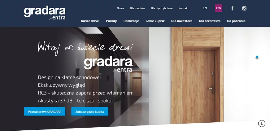
Entra Ltd. is a manufacturer of high-quality interior doors under the Asilo, Entra and Gradara brands, available through a nationwide sales network. For more than 30 years, it has used trends in modern design and manufacturing techniques to create its products. Gradara, an award-winning national and international brand of interior entrance doors, combines attractive design, functionality and ease of installation.
Diagnosis and objectives of the project
The created product service was to become the focal point of a distinctive new quality concept of offer communication on the Internet
The goal of the cooperation was to create a modern website, allowing users to intuitively go through the process of selecting doors and providing key information for both retail customers, investors and contractors.
The initial stage of the project led to an understanding of the client's needs and requirements, its sales and marketing strategy, as well as defining the assumptions of the created site and the main objectives it should fulfill. The challenge before us was to create and introduce a fresh, distinctive new concept for the offer communication of one of Entra's brands - Gradara.

Solution
The website's functionalities were created with the aim of engaging customers and acquiring valuable leads
In response to such formulated expectations, a concept for communication on the Internet and digital transformation (digital transformation) with a modern product website was developed. The target audience groups were also defined. Their needs were taken into account in the interaction design, which supports the client in meeting the previously defined objectives. When designing the site, we had in particular in mind the preparation of elements that engage users and the implementation of a strategy for acquiring leads to support the achievement of sales goals.
Design
Our goal was to keep the visual side consistent with the brand identity and character
The next stage involved the creation of the new site. Our idea was to create a graphic design for the site consistent with the client's visual identity and the main features of the brand and its products - modern and subdued design and functionality. The visual concept focused on clarity and ease of browsing content while putting the product at the center of the user's attention. A "tailor-made" content management system was implemented as part of the site. With customization, it facilitates the management of product information and also enables the preparation and publication of a product catalog visually consistent with the traditional catalog.
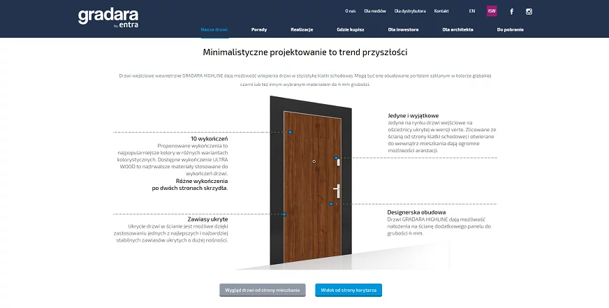
Product pages
The most important features of the product were presented in an intuitive way. The user was given the opportunity to check the appearance of the door from both the apartment and corridor sides.

Functionality
Within the service, dynamic modules have been implemented to present information in an attractive and intuitive way
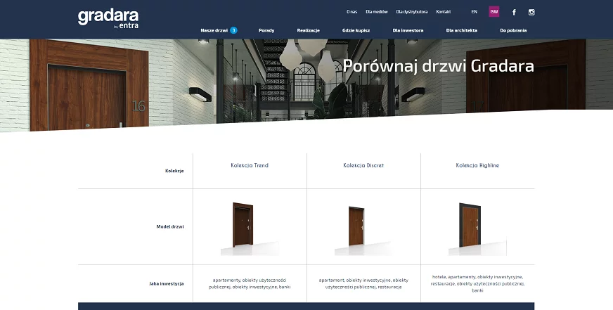
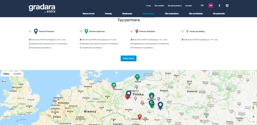
Increasing the functionality of the website was possible by expanding it with dedicated modules presenting information in a dynamic form. A distributor search system was created showing the sales network by category. In addition to providing basic contact information, it also made it possible to indicate the location and directions to dealers. In addition, a product comparison engine also became a prepared asset of the site. Choosing from among the products available on the site, the customer was given the opportunity to compare their visual, functional and technical features in an easy and clear way from a common view. In addition, the descriptions displayed help the user to understand the use of individual functionalities.
Door comparison engine
The module used allows the customer to compare many aspects and features of products on one screen.

Where to buy
With the inclusion of the Google Maps module, we enabled the user to find a retailer in the area of interest and get directions.

Maintenance
Ease of content creation and management and the ability to optimize the site for SEO were also important to us
When creating the site we also kept in mind the convenience and maximization of usability in its operation. Among other things, we equipped it with a mechanism that allows you to easily create separate campaign pages (landing pages). We also introduced functionality to optimize SEO activities.
Summary
The implementation of a "tailor-made" service enabled an in-depth study of the needs of the customer and its audience
The implementation of the gradara.pl website was preceded by the publication of the beta version of the site, as well as its testing and user opinion research confirmed by an evaluation survey. The result of the implemented project is the creation of a modern product website for a manufacturing company, which responds to the needs of a diverse audience. The site was prepared in accordance with the principles of Responsive Web Design, so it adapts to all types of devices, and was also optimized for search engines.
Product information management systems:
Welcome to our blog
Take a look at the articles on Product Information Management systems
See also


