New website for polish shipowner. POLFERRIES. New graphic design with new online marketing strategy.

Polish Baltic Shipping Co. (Polferries) is a polish ferry company with over 40 years of tradition. Polferries provides a ferry connection between Poland and Sweden as well as tour offer to Scandinavia.
The main goal of the project was to create a new, modern website with intuitive navigation. We tried to increase sales by better presentation of timetables and pricelist and by attractive tours pages.
Diagnosis and concept
At the beginning of the project, we collected information about the client's needs and expectations of the new design. Together we set up goals for the new website and plan a project schedule. The design process was based on a user-centered design approach (the process is focusing on gaining a deep understanding of who will be using the product during all stages of project).
We started with an expert audit which helped identify information structure. We focused on the conversion path to detect all potential problems that users can meet. To know users' opinion we conducted online surveys and user interviews. Thanks to all the information we could better understand users' expectations. Collected data was used during the prototyping process.
Realization
Design
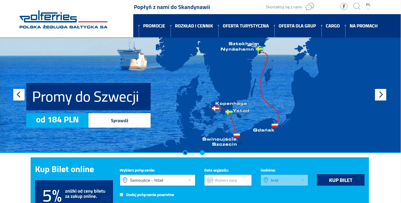
Our main goal was to create a modern and elegant look of new website, consistent with visual identification. We used navy blue and white colors to highlight the company's marine character. Thanks to minimalistic design user's attention is focused on the main information.
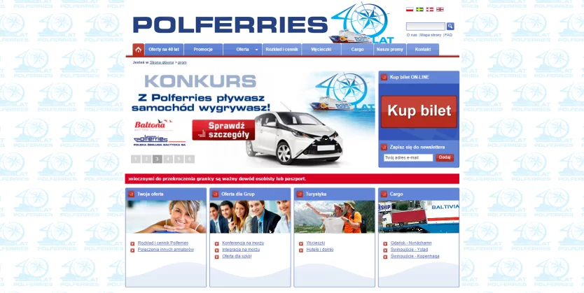
old website

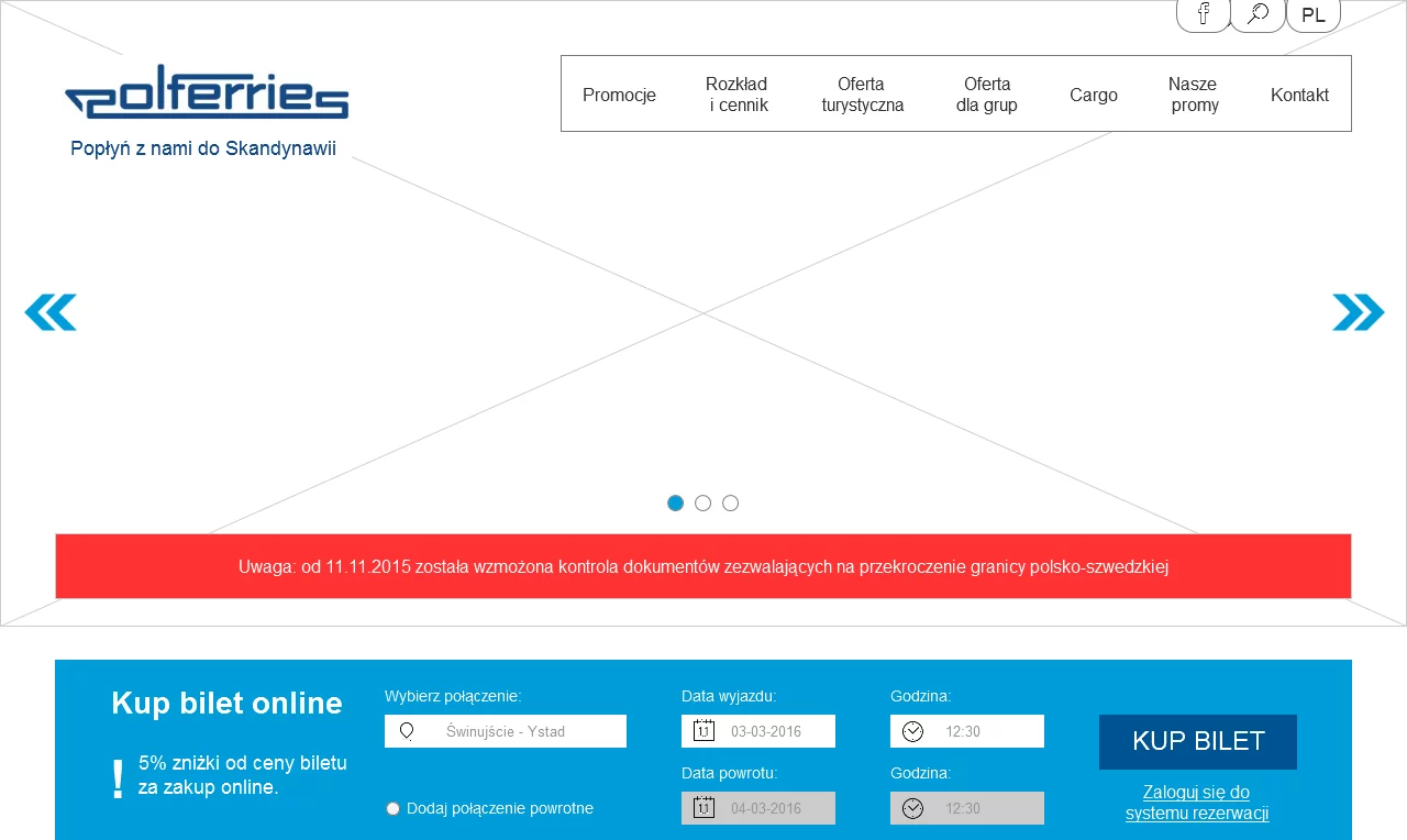
Mock-up

IA/UX
We reorganized information architecture on the website to less complicated. We minimized the amount of menu elements. Thanks to that the user can get easily get to the information on the website. All these elements make the new website more intuitive and easy to use. We used Responsive Web Design (RWD) technology to make sure that the new design will look on mobile devices as well as on desktops.
New website design

Conversion path optimization
Our goal was to increase online sales by reorganization of information architecture. We analyzed and rearrange the conversion path, moreover, we used interactive elements to stimulate purchase decisions. We redesign the route search mechanism and ferry timetable presentation. We implemented new mechanisms to increase the interest of tours offer. Another important element was to integrate new CMS with a ticket booking system. We also prepared a dedicated system for timetables and pricelist management. The client has the possibility of easy and quick updates of data. Thanks to that users have always access to actual information about the ferries schedule.
Effects:
In February 2017 we published a new website for Polferries. New modern and elegant design highlights the company's character. Thanks to the user-centered Design approach and complex redesign of information archoitecure, new website is intuitive and increase onlie sales. New design adapts to different devices thanks to RWD technology.

