New quality in product catalog communication and optimization of customer and brand experience.

Asilo is a brand of high-quality interior doors manufactured by Entra Sp. z o.o. Created in 2011, the Asilo door line was based on over 30 years of experience of the manufacturer. Asilo products, available in the nationwide distribution network, combine high-quality workmanship, comfort of use, design appreciated by architects and numerous possibilities of adjusting to the interiors of rooms and the needs of the user.
Project goals
The created product website was to be an intuitive information center about the brand's portfolio
The project assumed the creation of a new website that would clearly and intuitively present a wide range of brand products. In addition to making it easier for customers to choose doors and complementary products, our task was to design a page that would provide all information necessary for the customer in the purchasing process in an accessible manner.

Cooperation with the Asilo brand began with gathering requirements and expectations for the new site. We learned about the brand characteristics and elements affecting its sales and marketing strategy. In the design process, we also used our experience and previous cooperation with the Gradara brand, which co-creates the portfolio of Entra. This allowed us to design a website that meets all requirements and is consistent with the manufacturer"s image.

Design
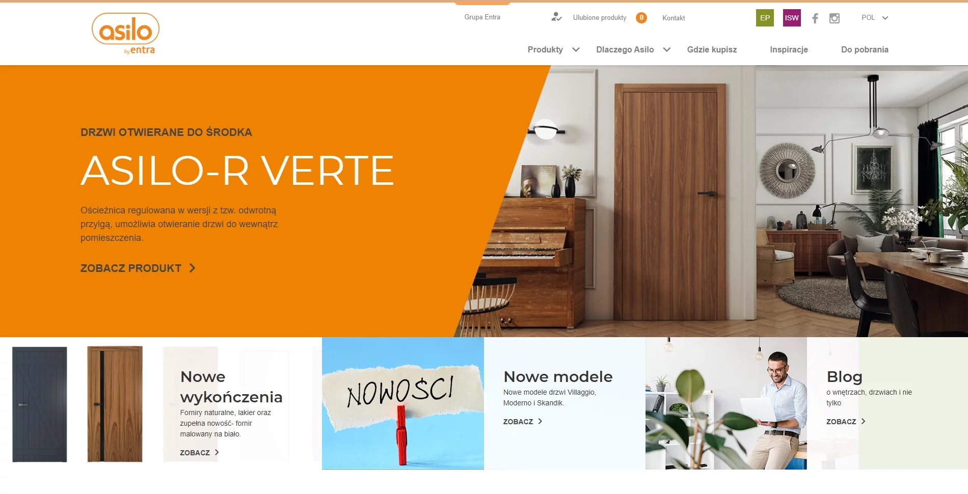
With its minimalist character, the site focuses on its key element - products
The next step was to create the graphic design of the page. The proposed design refers to the visual identity of the brand and its minimalist character allows us to focus the user's attention on the presented products. Asilo doors and their numerous designs and types of finish are the elements on which we wanted to focus the user's main attention. The white background used ensures transparency and makes it easier to compare individual product lines and models visually. While creating the website creation, we tried not to divert the user's attention from the product, which is particularly important with the multitude of available color variants and types of finishes. The extensive product galleries show the doors in carefully selected arrangements, additionally emphasizing their features, they also allow to put together individual models of each product line. Asilo doors have been presented as one of the key elements affecting the character of the room and building the atmosphere of the house.
Functionality
When designing the website, we focused on positive user experience
When designing the user experience path, the main goal was functionality and transparency. The products were categorized in a simple and understandable way. Characteristics of the products divided into lines containing numerous models required special care in the construction of the structure of products and related materials.
As a result, users have been able to browse all door models and sort them by category and finish style. Selected products have also been marked as bestseller or new, we have also added a view of the most popular finishes, which helps to shorten the door selection process. The view of each product line presents the visualization of selected doors in a central point, it also allows you to compare individual models included in it. In the following, the customer has the opportunity to read the description of the door frames matching the given line, available finishes, and files to download. All this information was assigned to a given product line, while product galleries were assigned to individual door models. The solutions used to allow the content of the page is not reloaded after each change of choice to a different product model. As a result, users' use of the site remains undisturbed.

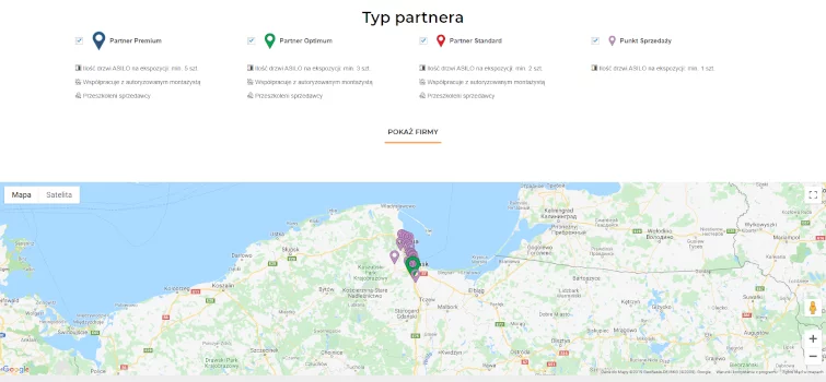
The website also introduces the functionality of searching for distributors of Asilo products. By using Google Maps, users can find a sales outlet in their location of interest and use driving directions. In addition, distributors were divided in terms of partner types differing mainly in the number of brand doors that are on display at a given point. The user can also check which sellers cooperate with authorized fitters. The mechanisms used to make it easier to guide the user through the entire door selection process, improve his experience and increase the chance of completing the process with a successful purchase.


