The art of asking questions - surveys during website redesign
Free consultationTopics
As designers, we want our designs to be as attractive as possible: technologically, stylistically and visually. This is not a bad approach - the world and technology are moving forward and we need to adapt to these changes. However, we often forget who we are designing for. This can cause the final result, despite the use of the latest technology and trends, to fail to meet the needs of users.
How to avoid this mistake? The easiest way is to simply ask. Ask users what they expect and need, and whether the changes made satisfy them.
Evaluation surveys
Surveys, interviews, usability tests and other UX research methods are designed to gather information about the users using a particular website/online store/application. All this information is used to understand the user, their needs, expectations and to learn about their previous experience with the product. The more data a designer has, the easier it is for him to understand the needs of the audience and design for them.
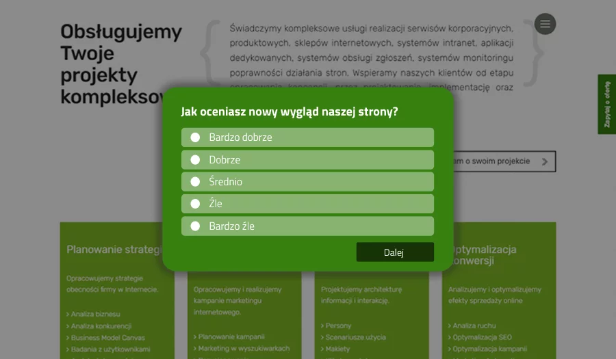
The fastest, cheapest and by far the easiest method is an online survey. By asking a few simple questions, we can learn a lot of interesting things that will help us design a better site. Even if we do not have a whole website redesign planned, it is worth asking users about their feelings about using the site. Perhaps the knowledge gained will suggest what improvements to implement, and this can bring measurable results, for example, in increasing the CTR. Sometimes small modifications, which do not involve large financial outlays, can increase the comfort of using the site, and thus the satisfaction of end users.
There are tools available on the market, allowing you to quickly and easily create a simple survey. Their implementation does not require a lot of IT knowledge and you can do it yourself, embedding a piece of code in the structure of the page. A noteworthy tool is GetSiteControl . It allows you to create surveys, view statistics and generate reports after the survey is published. You can use both closed and open-ended questions to create a survey, and you can customize the look and placement of the survey on the page. Finally, reports with the results can be generated. In addition, when using the survey for one site, there is no license cost!
When designing a new site design, it's easy to fall into the trap where we design for ourselves, not necessarily for the end user.

Ask wisely
However, before deciding to conduct a survey, it is worth considering its design and questions. You should start with a self-directed question: what do you want to find out - this will determine whether the questions in the survey are open or closed. It is not advisable to exaggerate the number of questions - the more there are, the fewer people will fill it out. If you want to find out detailed opinions or suggestions from users, it is worth using open-ended questions.
They give you the opportunity to present your opinion. Sometimes it's a single word, sometimes it's a long statement, but all this information is an indication of what can be improved. Closed questions work better when we are able to predict the answers or when we want to know the general impression: e.g. Do you like the new look of the website - yes / no. Surveys that consist of closed questions usually have a much higher completion rate. Well, we are lazy and usually don't want to fill out long questionnaires where we are required to justify our choices.
However, when the survey is short, the questions are simple and we already have a suggested answer, we are much more willing to answer. It really doesn't take much time to create a survey. Its results, in turn, can provide a lot of useful knowledge about the site. Asking users for their feelings, opinions and suggestions comes in handy not only when working on a new site, store or app. Even if we don't have plans to redesign the entire site, we can consider implementing subtle modifications, which in turn can contribute to a more positive user experience.